This website uses cookies so that we can provide you with the best user experience possible. Cookie information is stored in your browser and performs functions such as recognising you when you return to our website and helping our team to understand which sections of the website you find most interesting and useful.
Revolution Slider
As you might know, the revolution slider has lots of features and options.
We use the banner timer option in our template, but you can make other effect using the revolution slider options.

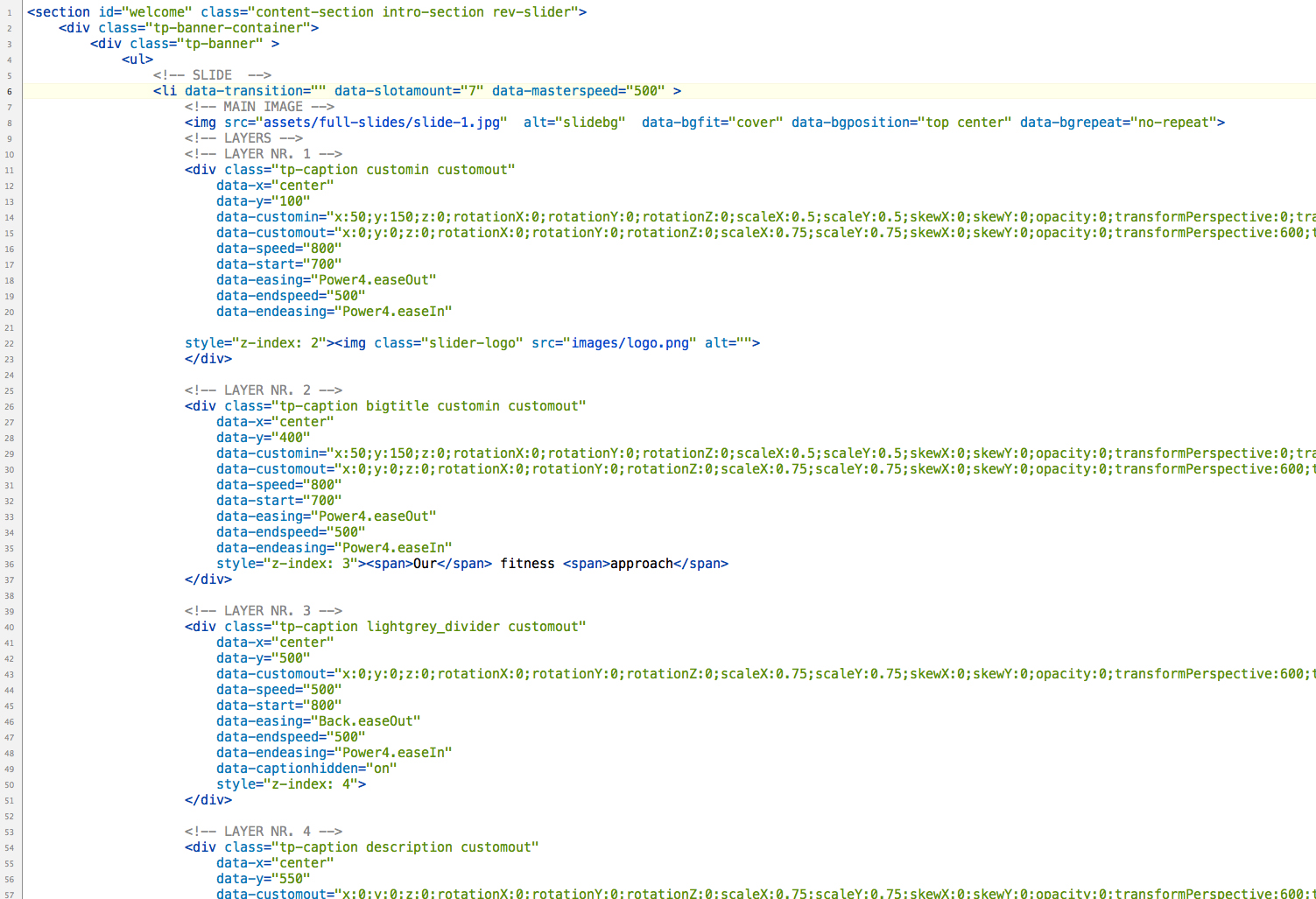
Revolution slider options & how to:
Slide Options
<li> – Every list item represents a new Slide. To Define Transitions, main links, etc. use the following data- values per list item.
Transition Effects
- data-transition
The appearance transition of this slide. You can define more than one, so in each loop the next slide transition type will be shown.
Flat Transitions:Slide To Top – slideup
Slide To Bottom – slidedown
Slide To Right – slideright
Slide To Left – slideleft
Slide Horizontal (depending on Next/Previous) – slidehorizontal
Slide Vertical (depending on Next/Previous) – slidevertical
Slide Boxes – boxslide
Slide Slots Horizontal – slotslide-horizontal
Slide Slots Vertical – slotslide-vertical
Fade Boxes – boxfade
Fade Slots Horizontal – slotfade-horizontal
Fade Slots Vertical – slotfade-vertical
Fade and Slide from Right – fadefromright
Fade and Slide from Left – fadefromleft
Fade and Slide from Top – fadefromtop
Fade and Slide from Bottom – fadefrombottom
Fade To Left and Fade From Right – fadetoleftfadefromright
Fade To Right and Fade From Left – fadetorightfadefromleft
Fade To Top and Fade From Bottom – fadetotopfadefrombottom
Fade To Bottom and Fade From Top – fadetobottomfadefromtop
Parallax to Right – parallaxtoright
Parallax to Left – parallaxtoleft
Parallax to Top – parallaxtotop
Parallax to Bottom – parallaxtobottom
Zoom Out and Fade From Right – scaledownfromright
Zoom Out and Fade From Left – scaledownfromleft
Zoom Out and Fade From Top – scaledownfromtop
Zoom Out and Fade From Bottom – scaledownfrombottom
ZoomOut – zoomout
ZoomIn – zoomin
Zoom Slots Horizontal – slotzoom-horizontal
Zoom Slots Vertical – slotzoom-vertical
Fade – fade
Random Flat – random-static
Random Flat and Premium – randomPremium Transitions:Curtain from Left – curtain-1
Curtain from Right – curtain-2
Curtain from Middle – curtain-3
3D Curtain Horizontal – 3dcurtain-horizontal
3D Curtain Vertical – 3dcurtain-vertical
Cube Vertical – cube
Cube Horizontal – cube-horizontal
In Cube Vertical – incube
In Cube Horizontal – incube-horizontal
TurnOff Horizontal – turnoff
TurnOff Vertical – turnoff-vertical
Paper Cut – papercut
Fly In – flyin
Random Premium – random-premium
Random Flat and Premium – random -
data-slotamount
The number of slots or boxes the slide is divided into. If you use boxfade, over 7 slots can be juggy.
-
data-masterspeed
The speed of the transition in “ms”. default value is 300 (0.3 sec)
- data-delay
A new Dealy value for the Slide. If no delay defined per slide, the dealy defined via Options will be used
Links (Full Slide Links)
- data-link
A link on the whole slide pic
- data-target
The target of the Link for the whole slide pic. (i.e. “_blank”, “_self”)
- data-slideindex
Possible values: next,back, 1-x (where x is the max. Amount of slide) If this value is set, click on slide will call the next / previous, or n th Slide.
Thumbnail
- data-thumb
An Alternative Source for thumbs. If not defined a copy of the background image will be used in resized form
Title
- data-title
In Navigation Style Preview1- preview4 mode you can show the Title of the Slides also. Due this option you can define for each slide its own Title
The Main Image
Each Slide (<li> </li>) MUST include a main image which is added as a simple <img> tag at the first level. It can be a Simpe image, a colored or transparent image, or dummy image as lazy load version.
Simple Image
- <imgsrc=“images/slides/slide13.jpg”>
Colored Background Instead of Image
- <imgsrc=“images/slides/transparent.png”style=“background–color:#56e34a“>
Lazy Loaded Image
- <imgsrc=“images/slides/dummy.jpg”data-lazyload=“images/slides/slide13.jpg”>
Tiled Image
- <imgsrc=“images/slides/slide13.jpg”data-bgrepeat=“repeat”data-bgfit=“normal”data-bgposition=“center center”>
Fitting Image
- <imgsrc=“images/slides/slide13.jpg”data-bgrepeat=“no-repeat”data-bgfit=“contain”data-bgposition=“center center”>
Covering Image
- <imgsrc=“images/slides/slide13.jpg”data-bgrepeat=“no-repeat”data-bgfit=“cover”data-bgposition=“center center”>
Bottom Right Aligned Covering Image
- <imgsrc=“images/slides/slide13.jpg”data-bgrepeat=“no-repeat”data-bgfit=“cover”data-bgposition=“right bottom”>
Ken Burns Animation on Image
- <imgsrc=“images/kenburns1.jpg”alt=“kenburns1”data-bgposition=“left bottom”data-kenburns=“on”data-duration=“2000”data-ease=“Power4.easeInOut”data-bgfit=“200”data-bgfitend=“100”data-bgpositionend=“center top”>
Image Attributes
- Lazy Loading
src=”images/slides/dummy.jpg” (or any other dummy small image to decrease the loading time of Document) data-lazyload=”path/filename” Here you need to declare the Path and File name of the image you wish to laod as Main Image in Slide - Background Repeat
data-bgrepeat:no-repeat / repeat / repeat-x / repeat-y (the way the image is shown in the slide main container) - Background Fit
data-bgfit:cover / contain / normal / width(%) height(%) (select one to decide how the image should fit in the Slide Main Container).
For Ken Burn use only a Number, which is the % Zoom at start. 100 will fit with Width or height automatically, 200 will be double sized etc.. - Background Fit End
data-bgfitend: Use only a Number . i.e. 300 will be a 300% Zoomed image where the basic 100% is fitting with width or height. - Background Position
data-bgposition:left top / left center / left bottom / center top / center center / center bottom / right top / right center / right bottom - Background Position End
data-bgpositionend:left top / left center / left bottom / center top / center center / center bottom / right top / right center / right bottom For Ken Burns Animation. This is where the IMG will be animatied - Ken Burns Effect
data-kenburns:on/off to turn on Ken Burns Effect or keep it disabled. - Duration for Ken Burns
data-duration:the value in ms how long the animation of ken burns effect should go. i.e. 3000 will make a 3s zoom and movement. - Easing of Ken Burns Effect
data-ease:Same values as by Caption Easings available. The Movement Easing.
The Captions / Layers
Each <li> (slide) can include unlimited amount of Captions. Caption are simple html markups with iframe, image, heading , paragraph and any other tags. Each Caption must be wrapped via a <div class=”caption”></div>.
Each Caption has some special classes and some data- attributes, to set animation type, position, speed, easings etc.
Caption Classes
- the “caption” class
It is the Wrapping main Class which is a MUST. Each Caption need to be defined like this, other way the Slider Plugin can not identifikate the Caption container
- Styling Captions (like “big_white”, “big_orange”, “medium_grey” etc…)
These are Styling classes created in the settings.css You can add unlimited amount of Styles in your own css file, to style your captions at the top level already
- Parallax Settings (like “rs-parallaxlevel-1”, “rs-parallaxlevel-2”, “rs-parallaxlevel-3” etc…)
You can define a Parallax Level for each Layer, which will allow the Layer to move based on scroll or mouse movements (if option activated). Based on the Class the Strength of the offset can be defined.
- Animation Classes
Animation Classes defined the start / end animations on Captions.
Incoming animation Classes:
sft – Short from Topsfb – Short from Bottomsfr – Short from Rightsfl – Short from Leftlft – Long from Toplfb – Long from Bottomlfr – Long from Rightlfl – Long from Leftskewfromleft – Skew from Leftskewfromright – Skew from Rightskewfromleftshort – Skew Short from Leftskewfromrightshort – Skew Short from Rightfade – fadingrandomrotate– Fade in, Rotate from a Random position and Degreecustomin – Custom Incoming Animation – see below all data settingsOutgoing animation Classes:
stt – Short to Topstb – Short to Bottomstr – Short to Rightstl – Short to Leftltt – Long to Topltb – Long to Bottomltr – Long to Rightltl – Long to Leftskewtoleft – Skew to Leftskewtoright – Skew to Rightskewtoleftshort – Skew Short to Leftskewtorightshort – Skew Short to Rightfadeout – fadingrandomrotateout– Fade in, Rotate from a Random position and Degreecustomout – Custom Outgoing Animation – see below all data settingsCustom Incoming / OutGoing settings:
data-customin=”rotationX:0;rotationY:0;rotationZ:0….” – How the Caption is Transformed before animation starts. All value will be animated to 0 or 1 to remove all transoformation of the Caption.data-customout=”rotationX:0;rotationY:0;rotationZ:0….”– The End Transformed Style after the animation finnished. All value will be animated from 0 or 1 to the selected transformation.
Custom Animation (in and out) Parameters set via data-customin and data-customout within the caption div. Parameter should be closed with “;”rotationX:0;rotationY:0;rotationZ:0 – value between -920 and +920. Rotation Direction set via X,Y,Z, Can be mixed
scaleX:1;scaleY:1 – value between 0.00 – 10.00 Scale width and height. 1 == 100%
skewX:1;skewY:1 – value between 0.00 – 10.00 Skew inVertical and/or horizontal direction 0 = no skew
opacity:1 – value between 0.00 – 1.00 Transparencity
transformOrigin:center center – Sets the origin around which all transforms occur. By default, it is in the center of the element (“50% 50%”). You can define the values using the keywords “top”, “left”, “right”, or “bottom” or you can use percentages (bottom right corner would be “100% 100%”) or pixels.
Values:left top / left center / left bottom / center top / center center / center bottom / right top / right center / right bottom or x% y%
transformPerspective:300 – To get your elements to have a true 3D visual perspective applied, you must either set the “perspective” property of the parent element or set the special “transformPerspective” of the element itself (common values range from around 200 to 1000, the lower the number the stronger the perspective distortion).
x:0;y:0; – the x / y distance of the element in px. i.e. x:-50px means vertical left 50px
Caption data- settings
- data-x
Possible Values are “left”, “center”, “right”, or any Value between -2500 and 2500.
If left/center/right is set, the caption will be siple aligned to the position. Any other “number” will simple set the left position in px of tha caption.At “left” the left side of the caption is aligned to the left side of the slider.
At “center” the center of caption is aligned to the center of slide.
At “right” the caption right side is aligned to the right side of the Slider. - data-y
Possible Values are “top”, “center”, “bottom”, or any Value between -2500 and 2500.
If top/center/bottom is set, the caption will be siple aligned to the position. Any other “number” will simple set the top position in px of tha caption.At “top” the top side of the caption is aligned to the top side of the slider.
At “center” the center of caption is aligned to the center of slide.
At “bottom” the caption bottom side is aligned to the bottom side of the Slider.
- data-hoffset
Only works if data-x set to left/center/right. It will move the Caption with the defined “px” from the aligned position. i.e. data-x=”center” data-hoffset=”-100″ will put the caption 100px left from the slide center horizontaly.
- data-voffset
Only works if data-y set to top/center/bottom. It will move the Caption with the defined “px” from the aligned position. i.e. data-x=”center” data-hoffset=”-100″ will put the caption 100px left from the slide center vertically.
- data-speed
The speed in milliseconds of the transition to move the Caption in the Slide at the defined timepoint.
- data-splitin
Split Text Animation (incoming transition) to “words”, “chars” or “lines”. This will create amazing Animation Effects on one go, without the needs to create more captions.
- data-elementdelay
A Value between 0 and 1 like 0.1 to make delays between the Splitted Text Element (start) Animations. Higher the amount of words or chars, you should decrease that number!
- data-splitout
Split Text Animation (outgoing transition) to “words”, “chars” or “lines”. Only available if data-end is set !
- data-endelementdelay
A Value between 0 and 1 like 0.1 to make delays between the Splitted Text Element (end) Animations. Higher the amount of words or chars, you should decrease that number!
- data-start
The timepoint in millisecond when/at the Caption should move in to the slide.
- data-easing
The Easing Art how the caption is moved in to the slide (note! Animation art set via Classes !).
Possible Values are:New Easings:Linear.easeNone Power0.easeIn (linear), Power0.easeInOut (linear), Power0.easeOut (linear), Power1.easeIn, Power1.easeInOut, Power1.easeOut, Power2.easeIn, Power2.easeInOut, Power2.easeOut, Power3.easeIn, Power3.easeInOut, Power3.easeOut, Power4.easeIn, Power4.easeInOut, Power4.easeOut, Quad.easeIn (same as Power1.easeIn), Quad.easeInOut (same as Power1.easeInOut), Quad.easeOut (same as Power1.easeOut), Cubic.easeIn (same as Power2.easeIn), Cubic.easeInOut (same as Power2.easeInOut), Cubic.easeOut (same as Power2.easeOut), Quart.easeIn (same as Power3.easeIn), Quart.easeInOut (same as Power3.easeInOut), Quart.easeOut (same as Power3.easeOut), Quint.easeIn (same as Power4.easeIn), Quint.easeInOut (same as Power4.easeInOut), Quint.easeOut (same as Power4.easeOut), Strong.easeIn (same as Power4.easeIn), Strong.easeInOut (same as Power4.easeInOut), Strong.easeOut (same as Power4.easeOut), Back.easeIn, Back.easeInOut, Back.easeOut, Bounce.easeIn, Bounce.easeInOut, Bounce.easeOut, Circ.easeIn, Circ.easeInOut, Circ.easeOut, Elastic.easeIn, Elastic.easeInOut, Elastic.easeOut, Expo.easeIn, Expo.easeInOut, Expo.easeOut, Sine.easeIn, Sine.easeInOut, Sine.easeOut, SlowMo.easeOld Easings: easeOutBack, easeInQuad, easeOutQuad, easeInOutQuad, easeInCubic, easeOutCubiceaseInOutCubic, easeInQuart, easeOutQuart, easeInOutQuart, easeInQuinteaseOutQuint, easeInOutQuint, easeInSine, easeOutSine, easeInOutSineeaseInExpo, easeOutExpo, easeInOutExpo, easeInCirc, easeOutCirc, easeInOutCirceaseInElastic, easeOutElastic, easeInOutElastic, easeInBack, easeOutBack, easeInOutBackeaseInBounce, easeOutBounce, easeInOutBounce - data-endspeed
The speed in milliseconds of the transition to move the Caption out from the Slide at the defined timepoint.
- data-end
The timepoint in millisecond when/at the Caption should move out from the slide.
- data-endeasing
The Easing Art how the caption is moved out from the slide (note! Animation art set via Classes !).
Possible Values are:New Easings:Linear.easeNone Power0.easeIn (linear), Power0.easeInOut (linear), Power0.easeOut (linear), Power1.easeIn, Power1.easeInOut, Power1.easeOut, Power2.easeIn, Power2.easeInOut, Power2.easeOut, Power3.easeIn, Power3.easeInOut, Power3.easeOut, Power4.easeIn, Power4.easeInOut, Power4.easeOut, Quad.easeIn (same as Power1.easeIn), Quad.easeInOut (same as Power1.easeInOut), Quad.easeOut (same as Power1.easeOut), Cubic.easeIn (same as Power2.easeIn), Cubic.easeInOut (same as Power2.easeInOut), Cubic.easeOut (same as Power2.easeOut), Quart.easeIn (same as Power3.easeIn), Quart.easeInOut (same as Power3.easeInOut), Quart.easeOut (same as Power3.easeOut), Quint.easeIn (same as Power4.easeIn), Quint.easeInOut (same as Power4.easeInOut), Quint.easeOut (same as Power4.easeOut), Strong.easeIn (same as Power4.easeIn), Strong.easeInOut (same as Power4.easeInOut), Strong.easeOut (same as Power4.easeOut), Back.easeIn, Back.easeInOut, Back.easeOut, Bounce.easeIn, Bounce.easeInOut, Bounce.easeOut, Circ.easeIn, Circ.easeInOut, Circ.easeOut, Elastic.easeIn, Elastic.easeInOut, Elastic.easeOut, Expo.easeIn, Expo.easeInOut, Expo.easeOut, Sine.easeIn, Sine.easeInOut, Sine.easeOut, SlowMo.easeOld Easings: easeOutBack, easeInQuad, easeOutQuad, easeInOutQuad, easeInCubic, easeOutCubiceaseInOutCubic, easeInQuart, easeOutQuart, easeInOutQuart, easeInQuinteaseOutQuint, easeInOutQuint, easeInSine, easeOutSine, easeInOutSineeaseInExpo, easeOutExpo, easeInOutExpo, easeInCirc, easeOutCirc, easeInOutCirceaseInElastic, easeOutElastic, easeInOutElastic, easeInBack, easeOutBack, easeInOutBackeaseInBounce, easeOutBounce, easeInOutBounce
Special Classes within the Caption container
- tp-scrollbelowslider
If this class added to an element within the caption container, it will scroll the Body Position to under the current slider (used in Fullscreen slider only)
- tp-resizeme
Add class tp-resizeme to the container inside the caption and every item within (included the same container) will be responsive resized. Only needed if more than one depth exist in the container !
- frontcorner, backcorner, frontcornertop, backcornertop
This classes added without any content in a closed div i.e. <div class=”frontcorner”></div> within the container. It will cut the left/right side of the caption background in 45° 1:1
Loop Animations Within the Layers
To Define Loop animations, everything which comes inside the Layer need to be wrapped with a div container where you can set the different Loop Animation Details
- rs-wave
<div class="rs-wave"  data-speed="2" data-angle="0" data-radius="20" data-origin="50% 50%">
  <img src="images/dummy.png" alt="" data-lazyload="images/newwave1.png">
</div>
- rs-pulse
<div class="rs-pulse"  data-easing="Power4.easeInOut" data-speed="2" data-zoomstart="1" data-zoomend="0.95">
  <img src="images/dummy.png" alt="" data-lazyload="images/cloud1.png">
 </div>
- rs-pendulum
<div class=" rs-pendulum"  data-easing="Power1.easeInOut" data-startdeg="-6" data-enddeg="6" data-speed="2" data-origin="50% 75%">
  <img src="images/dummy.png" alt="" data-lazyload="images/cloud1.png">
 </div>
- rs-pendulum
<div class=" rs-slideloop" data-easing="Power3.easeInOut" data-speed="0.5" data-xs="-5" data-xe="5" data-ys="0" data-ye="0">
  <img src="images/dummy.png" alt="" data-lazyload="images/cloud1.png">
 </div>
Static Layers
You can add now Static Layers to your Slider. Static Layers are defiend outside the Layers (since they are independent of any other elements and slides).
You will need to define the Start and End Slide and as always the start and end time where the Layer becomes visible, or hides again.
Add your Static Layers into the static layer wrapper under the <ul> tag within the Slider !
<ul>
...your slides and layers...
</ul>

<div class="tp-static-layers">
	<!-- LAYER NR. 1 -->
	<div class="tp-caption customin customout tp-static-layer"
		data-x="center" data-hoffset="100"
		data-y="bottom" data-voffset="0"
		data-customin="x:50;y:150;z:0;rotationX:0;rotationY:0;rotationZ:0;scaleX:0.5;scaleY:0.5;skewX:0;skewY:0;opacity:0;transformPerspective:0;transformOrigin:50% 50%;"
		data-customout="x:0;y:0;z:0;rotationX:0;rotationY:0;rotationZ:0;scaleX:0.75;scaleY:0.75;skewX:0;skewY:0;opacity:0;transformPerspective:600;transformOrigin:50% 50%;"
		data-speed="800"
		data-start="700"
		data-startslide="1"
		data-endslide="4"
		data-end="1800"
		data-easing="Power4.easeOut"
		data-endspeed="500"
		data-endeasing="Power4.easeIn"
		style="z-index: 3"><div class="rs-wave" data-angle="90" data-distance="40" data-radius="40" data-speed="2"><img src="images/woman.png" alt=""></div>
	</div>
</div>
Media in Slide
The slider can play Vimeo, YouTube and HTML5 (videoJs) Videos, in boxed and “FullSlide” size. Via the Embeded API’s the Slider will be paused, and restarted from the VideoPlayers. To use the Video Files in Slider see the following instructions.
Each Video file has the same data- options like:
- autoplay
Possible Values: “true” / “false” – will play the Video Directly when slider has been loaded
- nextslideatend
Possible Values: “true” / “false” after video come to the end position, it swaps to the next slide automatically.
- thumbimage
the full path to an image which will be shown as Thumbnail for the Video. (only if autoplay set to false, or autoplayonlyfirsttime set to true)
- forcecover
used only at HTML5 Videos. In case it is selected, the Videos will be resized to cover the full Slider size.
- volume
If value set to “mute”, video will be played muted.
- forcerewind
Every time the Slide is shown, the Video will rewind to the start.
- autoplayonlyfirsttime
Possible Values: “true” / “false” after first Autplay the video will not be played automatically
YouTube Video in Slide
Boxed version
YouTube VIdeo will be added within a caption due an iframe. The Following example shows an iFrame embeded YouTube Video in a caption (460px X 259px), i.e.:
- <divclass=“caption fade “
- data-autoplay=“true”
- data-autoplayonlyfirsttime=“true”
- data-thumbimage=“yourpath/yourimage”
- data-nextslideatend=“false”
- data-x=“130”
- data-y=“70”
- data-speed=“500”
- data-start=“10”
- data-easing=“easeOutBack”>
- <iframesrc=“http://www.youtube.com/embed/T8–OggjJKQ?enablejsapi=1&html5=1&hd=1&wmode=opaque&controls=1&showinfo=0;rel=0;”width=“460”height=“259”></iframe>
- </div>
You may need to use the origina=http://yourdomain or origin=https://yourdomain for YT Api issues !
FullWidth Version (/i.e.)
- <divclass=“caption fade fullscreenvideo“
- data-autoplay=“true”
- data-autoplayonlyfirsttime=“true”
- data-thumbimage=“yourpath/yourimage”
- data-nextslideatend=“true”
- data-x=“0”
- data-y=“0”
- data-speed=“500”
- data-start=“10”
- data-easing=“easeOutBack”>
- <iframesrc=“http://www.youtube.com/embed/T8–OggjJKQ?enablejsapi=1&html5=1&hd=1&wmode=opaque&controls=1&showinfo=0;rel=0;”width=“100%”height=“100%”></iframe>
- </div>
You may need to use the origina=http://yourdomain or origin=https://yourdomain for YT Api issues !
Vimeo Video
Vimeo Video API works only Online. It will not work well on Localhost due some Sandbox Security reason. Please always test it Online.
Boxed Version
- <divclass=“caption fade “
- data-autoplay=“true”
- data-nextslideatend=“false”
- data-x=“190”
- data-y=“110”
- data-speed=“500”
- data-start=“10”
- data-easing=“easeOutBack”>
- <iframesrc=“http://player.vimeo.com/video/29298709?title=0&byline=0&portrait=0;api=1”width=“460”height=“259”></iframe>
- </div>
FullWidth Version (i.e.)
- <divclass=“caption fade fullscreenvideo“
- data-autoplay=“true”
- data-nextslideatend=“true”
- data-x=“0”
- data-y=“0”
- data-speed=“500”
- data-start=“10”
- data-easing=“easeOutBack”>
- <iframesrc=“http://player.vimeo.com/video/29298709?title=0&byline=0&portrait=0;api=1”width=“100%”height=“100%”></iframe>
- </div>
HTML5 Video (videoJS)
The HTML5 Files are only loaded if the html5 video markup exist.
Boxed Version (i.e.)
- <divclass=“caption randomrotate “
- data-x=“20”
- data-y=“80”
- data-speed=“300”
- data-start=“2100”
- data-easing=“easeOutExpo”
- data-autoplay=“true”
- data-nextslideatend=“false”>
- <videoclass=“”controlspreload=“none”width=“600”height=“240”
- poster=“http://video-js.zencoder.com/oceans-clip.png”>
- <sourcesrc=“http://video-js.zencoder.com/oceans-clip.mp4”type=‘video/mp4’/>
- <sourcesrc=“http://video-js.zencoder.com/oceans-clip.webm”type=‘video/webm’/>
- <sourcesrc=“http://video-js.zencoder.com/oceans-clip.ogv”type=‘video/ogg’/>
- <trackkind=“captions”src=“demo.captions.vtt”srclang=“en”label=“English”/>
- </video>
- </div>
FullWidth Version (i.e.)
- <divclass=“caption randomrotate fullscreenvideo“
- data-x=“0”
- data-y=“0”
- data-speed=“300”
- data-start=“2100”
- data-easing=“easeOutExpo”
- data-autoplay=“true”
- data-nextslideatend=“true”>
- <videoclass=“”controlspreload=“none”width=“100%”height=“100%”
- poster=“http://video-js.zencoder.com/oceans-clip.png”>
- <sourcesrc=“http://video-js.zencoder.com/oceans-clip.mp4”type=‘video/mp4’/>
- <sourcesrc=“http://video-js.zencoder.com/oceans-clip.webm”type=‘video/webm’/>
- <sourcesrc=“http://video-js.zencoder.com/oceans-clip.ogv”type=‘video/ogg’/>
- <trackkind=“captions”src=“demo.captions.vtt”srclang=“en”label=“English”/>
- </video>
- </div>
Responsive Layouts
Auto-Responsive Layout
Responsive means that the slider will adjust to every screen width. The Sourrounding Container Size will define the Max width of the Slider. The Height will be auto calculated.
The basic containers are build like this ( in none Fullwidth, but 4 Level Responsive Version):
- .bannercontainer {
- width:100%;
- position:relative;
- padding:0;
- }
- .banner{
- width:100%;
- position:relative;
- }
FullScreen Layout
You can use the Slider also in FullScreen mode. It will need to have the possiblity to use the full width of the screen, means do not wrap it in any boxed container. For Fullscreen simple use the following markups and styles:
The markup could look like:
- <divclass=“fullscreen-container”>
- <divclass=“fullscreenbanner”>
- </div>
- </div>
The Style has 100% width and height simple.
- .fullscreen–container {
- width:100%;
- position:relative;
- padding:0;
- }
Dont forget to use the option fullScreen:”on” to use in the initialisation. If you wish to have an offset, which allows you to add i.e. a Menu over the fullscreen slider, just use the fullScreenOffsetContainer: option and set it to the container which wrapps the menu i.e